Verification
The catalog above records what themes claim. This section tests it.
How the test works
For every catalogued theme we take its signal colors — the small set that carries meaning (success/error/warning, diff add/delete, syntax roles) — and run two computations:
- Simulate each color under each dichromacy (deuteranopia, protanopia, tritanopia) using the Machado, Oliveira & Fernandes (2009) physiologically-based model at 100% severity — the same model behind Coblis and most modern simulators. This produces what each color actually looks like to a viewer with that deficiency.
- Measure the closest pair among those simulated colors using CIEDE2000 (ΔE00), the standard perceptual color-distance metric. The minimum pairwise distance is the theme’s worst case: the two signals most likely to be confused.
How to read the numbers
ΔE00 is roughly: ~1 = a just-noticeable difference under ideal lab conditions; <3 = two colors most people will struggle to tell apart on a real screen; >8 = clearly different at a glance. A theme is only as strong as its weakest pair.
Verdict scale (a heuristic, not pass/fail):
- STRONG — closest pair ≥ 8 ΔE00 under all three dichromacies. Robust for any viewer.
- ok — closest pair ≥ 3. Usable, but the closest pair is a known tight spot.
- WEAK — closest pair < 3 under at least one deficiency. Some pair collapses on hue+lightness.
Reproduce every number below: python3 scripts/verify_colorblind_themes.py (stdlib only,
deterministic — it reads the same hex tables that generate the examples).
| Tier | Themes (mode) |
|---|---|
| STRONG (robust across all three) | Kiro (dark+light), Wireshark (dark+light), Cindervale (dark), Insomnia (dark), Blinds (dark), Opo (light) |
| ok (no pair fully collapses) | datum (both), Dalton (both), Dichromatic, Gentle (dark), Monokai Deuteranopia, Pitaya, Blinds (light), Opo (dark), Pierre (light), Lx Deep Sea, Color Blind Themes, ef-themes (light), One Dark Pro, Hakimi (dark), dracula-colorblind |
| WEAK (a pair collapses for ≥1 deficiency) | GitHub/Gemini (both modes), Grafana (both), coder (dark), modus-deuteranopia (both), Pierre (dark), vision.nvim, morimo, Gentle (light), ef-themes (dark), Hakimi (light), ColorSafe, Shroom Space |
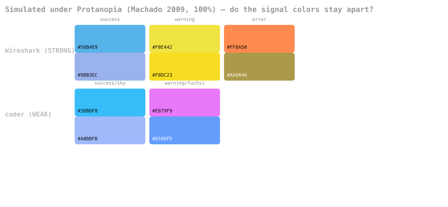
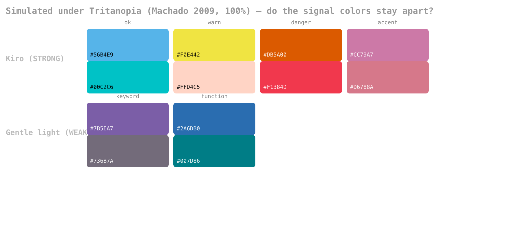
See the difference, don’t just read it. Each plate below shows a STRONG theme against a WEAK theme under one simulated dichromacy — Normal row, then the CVD view. The WEAK pair’s two chips collapse to near-identical tones; the STRONG pair stays apart.
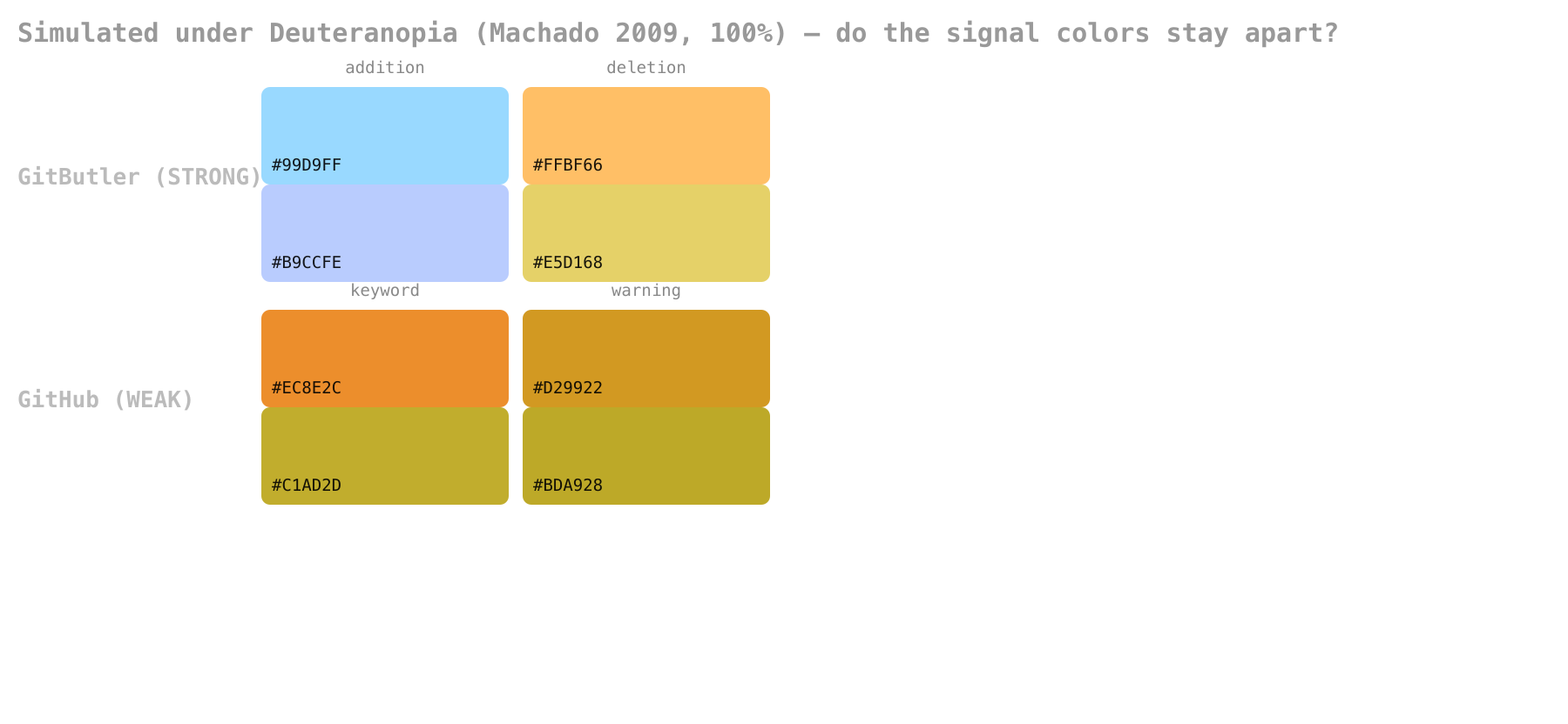
Under deuteranopia, GitHub’s keyword #ec8e2c and warning #d29922 become #C1AD2D and #BDA928
— 7.5 RGB units apart, effectively one color. GitButler’s addition #99d9ff and deletion #ffbf66
stay 156 units apart.
Read this table honestly — three caveats:
- A WEAK verdict is not “broken.” Most of these themes deliberately add a luminance gap
between hues that share an axis (GitHub’s keyword orange
#ec8e2cvs. warning amber#d29922collapse to ΔE≈1.1 in hue under deuteranopia, but they’re never used as a binary good/bad signal). The metric measures hue+lightness collapse; it does not model font weight, icons, or the redundant text cues these UIs also provide. - Single-deficiency themes collapse by design under the others. modus-deuteranopia scoring WEAK
under deuteranopia looks alarming until you see the weakest pair is red
#ff5f59vs green#44bc44— two colors the deuteranopia variant deliberately stops using as a semantic pair (errors route to a different channel). Judge a theme against the deficiency it targets. - The strongest independent signal is the engineering gate, not the hue choice. Every STRONG entry (Kiro, Wireshark, Cindervale, Opo, Blinds) ships a test that measures exactly this and fails the build on regression — which is why they top the table. Themes that only assert CVD safety cluster at the bottom.
The full per-theme numbers (all three deficiencies, weakest pair identified) are the script’s stdout and are reproducible.
The one-line takeaway: the themes that measure survive; the themes that claim often don’t. If you’re choosing a theme for a CVD user, prefer one with a simulation/contrast build gate.
App/platform-level themes verify far better than editor themes
Running the same metric over the app-level signal palettes (the small good/bad/status sets each product shows) gives a markedly different picture: 11 STRONG, 3 ok, 5 WEAK — versus the editor/terminal tier’s 8/17/17. Apps only need to separate 2–4 status colors, so they can space them far apart; editors must cram 6–8 syntax roles into one palette.
| Tier | App-level themes |
|---|---|
| STRONG | GitButler (dark ΔE≈45, light ΔE≈61 — near-perfect), Cura, SimpleCov (dark), plannotator (dark), iamb, OpenFront.io, Jenkins Wall Display, deepinv, narmi, Insomnia, Wireshark-tritan |
| ok | Talishar deuteranopia + protanopia palettes, Moira |
| WEAK | Gitea (both), SimpleCov (light), plannotator (light), Talishar tritanopia palette |
Two findings worth naming:
- Per-deficiency palettes confirmed empirically. Talishar ships one palette per dichromacy, and the numbers show exactly why that’s the right call: each palette is strong under its target deficiency (deutan palette ΔE 17.3 under deuteranopia; protan ΔE 20.2 under protanopia) but collapses under the others (tritan palette: 2.6 under deuteranopia). Per-deficiency variants beat one “universal” palette — matching what Grafana (4 themes) and modus/ef do.
- The GitHub orange/amber weakness propagates downstream. Gitea and SimpleCov inherit GitHub’s
colorblind pair (
#f0883eorange vs#d29922/#9a6700amber), and both score WEAK for the same reason the flagship does. SimpleCov’s dark mode dodges it (its missed-orange is far from its skipped-yellow); its light mode doesn’t. When you port a palette, re-measure it.
GitButler is the strongest CVD palette in this entire report — its diff addition/deletion text
pair (#99d9ff/#ffbf66 dark, #0d59bf/#bf590d light) sits ΔE 42–61 apart under every
dichromacy, roughly 5× the “clearly different” threshold. That’s what designing the two-color case
from scratch, rather than remapping an existing 8-color palette, buys you.